目次
(0)ggplot2による描画の概略
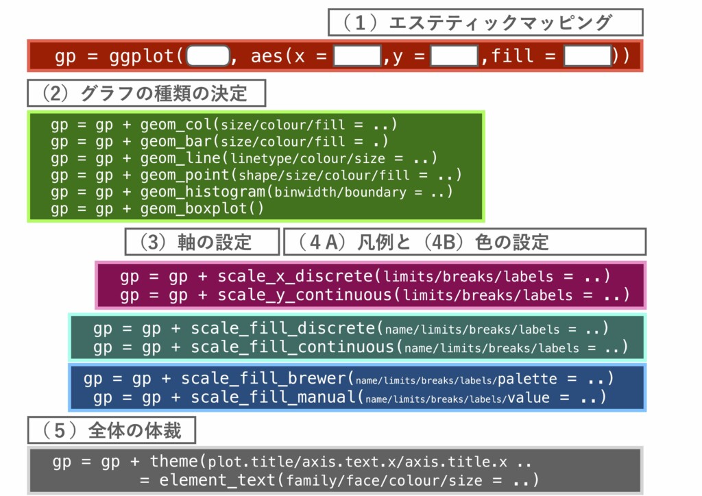
- [PDF]|ggplot2による描画の概略
#準備
# ggpplot2ライブラリを使えるようにします
install.packages("ggplot2")
library(ggplot2)

# gcookbookライブラリを使えるようにします
install.packages("gcookbook")
library(gcookbook)

# 例えば以下のようなデータフレームが使えます。
head(heightweight)
#. sex ageYear ageMonth heightIn weightLb
#1   f   11.92      143     56.3     85.0
#2   f   12.92      155     62.3    105.0
#3   f   12.75      153     63.3    108.0
#4   f   13.42      161     59.0     92.0
#5   f   15.92      191     62.5    112.5
#6   f   14.25      171     62.5    112.0
#(1)エステティックマッピング
## x軸に年齢、y軸に身長、fill属性に性別を割り振る
## この時点では何のグラフも出力されません
gp = ggplot(heightweight,aes(x=ageYear,y=heightIn,fill=sex)); gp
#(2)散布図としてグラフ化する
gp = gp + geom_point(shape=21,size=6); gp
#(3)軸の設定
gp = gp + scale_x_continuous(limits=c(10,20),breaks=c(10,15,20)); gp
gp = gp + scale_y_continuous(limits=c(0,100),breaks=c(0,50,100)); gp
#(4A)凡例の設定
gp1 = gp + scale_fill_discrete(name = "Gender", labels=c("Female","Male")); gp1
#(4B)凡例と色の設定
gp1 = gp + scale_fill_grey(name = "Gender", labels=c("Female","Male"),
                           start=0.2, end=0.8); gp1
gp1 = gp + scale_fill_brewer(name = "Gender", labels=c("Female","Male"),
                             palette="Set2"); gp1
#(5)全体の体裁の設定
gp2 = gp1 + theme(
    legend.title = element_text(size = 30),
    axis.title.x = element_text(size = 30),
    axis.title.y = element_text(size = 30),
    axis.text.x = element_text(size = 20),
    axis.text.y = element_text(size = 20),
    legend.text = element_text(size=20)
  );gp2
(1)各種のグラフ
棒グラフ [geom_col]
#デフォルトの出力
# gcookbookのライブラリを使います
# インストールが済んでいない人は
# install.packages("gcookbook")を実行
library(gcookbook)

# 使用するデータフレーム
BOD
#Time demand
#1    1    8.3
#2    2   10.3
#3    3   19.0
#4    4   16.0
#5    5   15.6
#6    7   19.8

# 基本レイヤを作成
## この時点では何も出力されません
gp = ggplot(BOD,aes(x=Time,y=demand))

# デフォルトの棒グラフ(塗りは黒、幅は0.9)
gp + geom_col()

# 棒グラフの塗りつぶしを白、枠線を黒とし、枠線のサイズを0.2とする。
gp + geom_col(fill="white",colour="black", size=0.2)

# 棒グラフの幅を最大幅の半分とする(デフォルトは0.9)
gp + geom_col(width=0.5)
#属性の要素ごとに分ける方法
library(gcookbook)
cabbage_exp
#. Cultivar Date Weight        sd  n         se
#1      c39  d16   3.18 0.9566144 10 0.30250803
#2      c39  d20   2.80 0.2788867 10 0.08819171
#3      c39  d21   2.74 0.9834181 10 0.31098410
#4      c52  d16   2.26 0.4452215 10 0.14079141
#5      c52  d20   3.11 0.7908505 10 0.25008887
#6      c52  d21   1.47 0.2110819 10 0.06674995

# 基本レイヤを作成
## x軸をData、y軸をWeight、塗りをCultivarにマッピング
gp = ggplot(cabbage_exp,aes(x=Date,y=Weight,fill=Cultivar))

# デフォルトはfillを積み上げる(棒グラフ)
gp + geom_col()
# 引数で「積み上げ」を明示的に指定
gp + geom_col(position = position_stack())
## 積み上げ順序の反転
gp + geom_col(position = position_stack(reverse = TRUE))
# 100%積み上げ棒グラフとする
gp + geom_col(position = "fill")

# 水平方向に並べる(棒グラフ)
## デフォルトはfill属性同士はぴたりと張り付く
gp + geom_col(position = position_dodge())
# 幅を0.7とし、隙間を0.1だけ空ける。
## この場合、幅に隙間を足した値をposition_dodgeの引数に与える
gp + geom_col(position = position_dodge(0.8),width=0.7)
gp + geom_col(position = position_dodge(0.72),width=0.7) #隙間を狭める

# fillではなくinteractionを使っても同じことができます
# fillではなくinteractionを使っても同じことができます
gp = ggplot(cabbage_exp,aes(x=interaction(Date,Cultivar),
                            y=Weight,fill=Cultivar))
gp + geom_col()
#エラーバーの作成
# cabbage_expより、Cultivarがc39のものだけ取り出す
cabbage_exp0 = cabbage_exp[cabbage_exp$Cultivar=="c39",]
#  Cultivar Date Weight        sd  n         se
#1      c39  d16   3.18 0.9566144 10 0.30250803
#2      c39  d20   2.80 0.2788867 10 0.08819171
#3      c39  d21   2.74 0.9834181 10 0.31098410

gp0 = ggplot(cabbage_exp0,aes(x=Date,y=Weight))
gp1 = gp0 + geom_col(fill="white",colour="black")

# エラーバーの作成(widthはエラーバーの横幅)
gp1 + geom_errorbar(aes(ymin=Weight-se,ymax=Weight+se),width=.2)


# 横ならびタイプ(dodge)でエラーバーを追加する時
## 棒グラフのデフォルトのずらし幅(0.9)に合わせる。
gp + geom_col(position = position_dodge()) +
  geom_errorbar(aes(ymin=Weight-se,ymax=Weight+se),
                position=position_dodge(0.9), width=.2)
棒グラフ(数え上げ) [geom_bar]
#同じ値のものを数え上げる
library(gcookbook)
# mtcarsの最初の6行を表示
head(mtcars)
#                   mpg cyl disp  hp drat    wt  qsec vs am gear carb
#Mazda RX4         21.0   6  160 110 3.90 2.620 16.46  0  1    4    4
#Mazda RX4 Wag     21.0   6  160 110 3.90 2.875 17.02  0  1    4    4
#Datsun 710        22.8   4  108  93 3.85 2.320 18.61  1  1    4    1
#Hornet 4 Drive    21.4   6  258 110 3.08 3.215 19.44  1  0    3    1
#Hornet Sportabout 18.7   8  360 175 3.15 3.440 17.02  0  0    3    2
#Valiant           18.1   6  225 105 2.76 3.460 20.22  1  0    3    1

# 列名cylのデータを確認
mtcars$cyl
#[1] 6 6 4 6 8 6 8 4 4 6 6 8 8 8 8 8 8 4 4 4 4 8 8 8 8 4 4 4 8 6 8 4

# 各要素の数を数える
table(mtcars$cyl)
# 4  6  8
#11  7 14

# 列名cylをカテゴリカル変数に変更し、
# 各要素の個数を数え上げて棒グラフとして表示
ggplot(mtcars,aes(x=factor(cyl))) + geom_bar()
# factorにしない場合、X軸のラベルに5と7も表示されることに注意
ggplot(mtcars,aes(x=cyl)) + geom_bar()

# 数え上げた個数を棒グラフ上に表示
ggplot(mtcars,aes(x=factor(cyl))) + geom_bar() +
  geom_text(aes(label=..count..),stat="count",
            vjust=1.5,colour="white")
#属性の要素ごとに分ける方法
# 列名cylのデータを確認
mtcars$gear
#[1] 4 4 4 3 3 3 3 4 4 4 4 3 3 3 3 3 3 4 4 4 3 3 3 3 3 4 5 5 5 5 5 4

table(mtcars[,c("cyl","gear")])
#     gear
#cyl  3  4  5
#  4  1  8  2
#  6  2  4  1
#  8 12  0  2

# 変数cylと変数gearの組み合わせについて、gearで色分け
ggplot(mtcars,aes(x=interaction(cyl,gear),fill=factor(gear))) + geom_bar()
# 変数cylで色分け
ggplot(mtcars,aes(x=interaction(cyl,gear),fill=factor(cyl))) + geom_bar()

# fillにマッピングされた変数(数値)をファクタにしない場合、
# 連続値として扱われ、カラーバーで色付けされることに注意
ggplot(mtcars,aes(x=interaction(cyl,gear),fill=gear)) + geom_bar()
ggplot(mtcars,aes(x=interaction(cyl,gear),fill=cyl)) + geom_bar()

# interactionを使わない方法の例
## デフォルトは積み上げ
ggplot(mtcars,aes(x=cyl,fill=factor(gear))) + geom_bar()
ggplot(mtcars,aes(x=gear,fill=factor(cyl))) + geom_bar()
## 引数にposition=position_dodge()で横並びにする
ggplot(mtcars,aes(x=cyl,fill=factor(gear))) + geom_bar(position=position_dodge())
ggplot(mtcars,aes(x=gear,fill=factor(cyl))) + geom_bar(position=position_dodge())
折れ線グラフ [geom_line]
#基本
library(gcookbook)
BOD
#Time demand
#1    1    8.3
#2    2   10.3
#3    3   19.0
#4    4   16.0
#5    5   15.6
#6    7   19.8

# 基本レイヤの出力
gp = ggplot(BOD,aes(x=Time,y=demand))

# デフォルトのグラフ
gp + geom_line()

# 線の色を深緑にして、線の太さを1.5とする。
gp + geom_line(colour = "dark green",size=1.5)

# 線を点線とする。
gp + geom_line(linetype="dashed")

# xをファクタにすると、カテゴリカルな系列と解釈され、
# x軸の6が取り除かれます。
## aes(group=1)は、Timeが同じグループに属していることを
## 明示しています。(無いとエラーとなります)
gp = ggplot(BOD,aes(x=factor(Time),y=demand,group=1))
gp + geom_line()
#属性の要素ごとに分ける方法
library(gcookbook)
tg
#. supp dose length
#1   OJ  0.5  13.23
#2   OJ  1.0  22.70
#3   OJ  2.0  26.06
#4   VC  0.5   7.98
#5   VC  1.0  16.77
#6   VC  2.0  26.14

# 基本レイヤの作成
gp = ggplot(tg,aes(x=dose,y=length,colour=supp))

# suppの要素(OJ、VC)ごとに、色分けして出力
gp + geom_line()

# 線の描画をグループ間で左右に0.2だけずらす
gp + geom_line(position = position_dodge(0.2))

# 同じ位置に点を重ねる
gp + geom_line(position = position_dodge(0.2)) +
  geom_point(position=position_dodge(0.2),shape=21,size=5,fill="white")

# suppをlinetypeでマッピング
ggplot(tg,aes(x=dose,y=length,linetype=supp)) + geom_line()
#エラーバーの描画
library(gcookbook)
cabbage_exp
#. Cultivar Date Weight        sd  n         se
#1      c39  d16   3.18 0.9566144 10 0.30250803
#2      c39  d20   2.80 0.2788867 10 0.08819171
#3      c39  d21   2.74 0.9834181 10 0.31098410
#4      c52  d16   2.26 0.4452215 10 0.14079141
#5      c52  d20   3.11 0.7908505 10 0.25008887
#6      c52  d21   1.47 0.2110819 10 0.06674995

# ドッジの設定を変数に保存
pd = position_dodge(0.3)

# Cultivarの要素に基づき、折れ線グラフを分けて描画
# 折れ線に関して、Cutivarでグループ分けすることを
# 明示的に伝える必要がある(colourをerrorbarでも使っているため)
gp = ggplot(cabbage_exp,
            aes(x=Date,y=Weight,colour=Cultivar,group=Cultivar))
# エラーバーの描画
gp + geom_errorbar(
  aes(ymin=Weight-se,ymax=Weight+se),
  width=.2,size=0.25,colour="black",position=pd) +
  geom_line(position=pd) +
  geom_point(position=pd,size=5)
散布図 [geom_point]
#基本
library(gcookbook)

# heightweightの最初の6行
head(heightweight)
#. sex ageYear ageMonth heightIn weightLb
#1   f   11.92      143     56.3     85.0
#2   f   12.92      155     62.3    105.0
#3   f   12.75      153     63.3    108.0
#4   f   13.42      161     59.0     92.0
#5   f   15.92      191     62.5    112.5
#6   f   14.25      171     62.5    112.0

# 基本レイヤ
gp = ggplot(heightweight,aes(x=ageYear,y=heightIn))

# デフォルトの散布図を出力
gp + geom_point()

# 正方形の点(22)、サイズを3、塗りつぶしの色を白に
gp + geom_point(shape=22, size = 3, fill = "white")

# 点の枠線をdarkredにする(他は上を参照)。
gp + geom_point(shape=22, size = 4, colour="darkred", fill = "white")
#グループ分け
library(gcookbook)

# heightweightの最初の6行
head(heightweight)
#. sex ageYear ageMonth heightIn weightLb
#1   f   11.92      143     56.3     85.0
#2   f   12.92      155     62.3    105.0
#3   f   12.75      153     63.3    108.0
#4   f   13.42      161     59.0     92.0
#5   f   15.92      191     62.5    112.5
#6   f   14.25      171     62.5    112.0

# 性別(sex)で色分け
gp_col = ggplot(heightweight,aes(x=ageYear,y=heightIn,colour=sex))
gp_col + geom_point()

# 性別(sex)で形状を変える
gp_shape = ggplot(heightweight,aes(x=ageYear,y=heightIn,shape=sex))
gp_shape + geom_point()

# 性別(sex)で色も形も変える
gp_colshape =
  ggplot(heightweight,aes(x=ageYear,y=heightIn,colour=sex,shape=sex))
gp_colshape + geom_point(size=5)
ヒストグラム [geom_histogram]
#基本
library(gcookbook)

# faithfulの最初の6行
head(faithful)
#  eruptions waiting
#1     3.600      79
#2     1.800      54
#3     3.333      74
#4     2.283      62
#5     4.533      85
#6     2.883      55

# 基本レイヤ
gp = ggplot(faithful,aes(x=waiting))

# デフォルトのヒストグラム
gp + geom_histogram()

# ヒストグラムの塗りつぶしの色を白に、枠線の色を黒とする。
gp + geom_histogram(fill="white",colour="black")

# ビン幅を8に、ビンの開始を31とする。
# [31~39), [39~47), [47~55), ...(最大はデータによる)
gp + geom_histogram(binwidth=8, boundary = 31,
                    fill="white",colour="black")

# ビン幅を[31~39), [39~47), [47~55), ...[87~95)とする
gp + geom_histogram(breaks = seq(31,95,by=8),
               fill="white",colour="black")
#グループ分け
library(dplyr)
library(MASS)

# faithful(出生時体重)の最初の6行
head(birthwt)
#   low age lwt race smoke ptl ht ui ftv  bwt
#85   0  19 182    2     0   0  0  1   0 2523
#86   0  33 155    3     0   0  0  0   3 2551
#87   0  20 105    1     1   0  0  0   1 2557
#88   0  21 108    1     1   0  0  1   2 2594
#89   0  18 107    1     1   0  0  1   0 2600
#91   0  21 124    3     0   0  0  0   0 2622

# smoke=0:喫煙なし
# smoke=1:喫煙あり
# bwt:出生児体重

# 喫煙の有無ごとにヒストグラムを分けて描画
gp = ggplot(birthwt,aes(x=bwt,fill=factor(smoke)))
## デフォルトでは積み上げで表示
gp + geom_histogram()
## 横並びではよくわからない
gp + geom_histogram(position=position_dodge())
## 重ねて表示(半透明とする)
gp + geom_histogram(position=position_identity(),alpha=0.6)


# ファセット(facet_grid)を使うと、
# グループごとに異なるグラフで描画をしてくれる
## facet_grid関数の引数に、グループ分けしたい変数を指定
## 書式:facet_grid(XXX ~ .)

# 喫煙の有無(smoke)でグループ分け
gp = ggplot(birthwt,aes(x=bwt))
gp + geom_histogram(fill="white",colour="black") +
  facet_grid(smoke ~ .)

# 人種(race)でグループ分け
gp + geom_histogram(fill="white",colour="black") +
  facet_grid(race ~ .)
箱ひげ図 [geom_boxplot]
#基本
library(dplyr)
library(MASS)

# faithful(出生時体重)の最初の6行
head(birthwt)
#   low age lwt race smoke ptl ht ui ftv  bwt
#85   0  19 182    2     0   0  0  1   0 2523
#86   0  33 155    3     0   0  0  0   3 2551
#87   0  20 105    1     1   0  0  0   1 2557
#88   0  21 108    1     1   0  0  1   2 2594
#89   0  18 107    1     1   0  0  1   0 2600
#91   0  21 124    3     0   0  0  0   0 2622

# race(人種)は1,2,3のいずれか
table(birthwt$race)
# 1  2  3
#96 26 67

# 基本レイヤの作成
## race(人種) をファクタに変換
gp = ggplot(birthwt,aes(x=factor(race),y=bwt))

# デフォルトの箱ひげ図
gp + geom_boxplot()

# 外れ値の範囲設定(IQR x 1.5)および、描画の形
gp + geom_boxplot(outlier.size=1.5, outlier.shape = 21)

# 外れ値を表示しない
## dotplotを重ね書きするときには表示しないのがよい
gp + geom_boxplot(outlier.shape = NA)

# birthwtの全ての行を対象に箱ひげ図を作成
## xに任意の値を与える(下の場合1)
ggplot(birthwt,aes(x=1,y=bwt)) + geom_boxplot()

## x軸の目盛とラベルを除く
ggplot(birthwt,aes(x=1,y=bwt)) + geom_boxplot() +
  scale_x_continuous(breaks=NULL) +
  theme(axis.title.x = element_blank())
#N x Mの箱ヒゲ図
library(dplyr)
library(MASS)

# faithful(出生時体重)の最初の6行
head(birthwt)
#   low age lwt race smoke ptl ht ui ftv  bwt
#85   0  19 182    2     0   0  0  1   0 2523
#86   0  33 155    3     0   0  0  0   3 2551
#87   0  20 105    1     1   0  0  0   1 2557
#88   0  21 108    1     1   0  0  1   2 2594
#89   0  18 107    1     1   0  0  1   0 2600
#91   0  21 124    3     0   0  0  0   0 2622

# smoke(喫煙の有無: 0,1)
# race(人種:1,2,3)
# smoke x raceは合計6種類
table(birthwt[,c("race","smoke")])
#     smoke
#race  0  1
#   1 44 52
#   2 16 10
#   3 55 12

# 上記の6つのグループそれぞれで箱ひげ図を出力

# smokeで色分けする場合(いずれもファクタに変換する)
ggplot(birthwt,aes(x=factor(race),y=bwt,fill=factor(smoke))) +
  geom_boxplot()
## 凡例ラベルの表記を変更
ggplot(birthwt,aes(x=factor(race),y=bwt,fill=factor(smoke))) +
  geom_boxplot() +
  scale_fill_discrete(labels=c("NO SMOKE","SMOKE"))

# raceで色分けする場合
ggplot(birthwt,aes(x=factor(smoke),y=bwt,fill=factor(race))) +
  geom_boxplot()
#dotplotを重ねて描画
library(dplyr)
library(MASS)

# faithful(出生時体重)の最初の6行
head(birthwt)
#   low age lwt race smoke ptl ht ui ftv  bwt
#85   0  19 182    2     0   0  0  1   0 2523
#86   0  33 155    3     0   0  0  0   3 2551
#87   0  20 105    1     1   0  0  0   1 2557
#88   0  21 108    1     1   0  0  1   2 2594
#89   0  18 107    1     1   0  0  1   0 2600
#91   0  21 124    3     0   0  0  0   0 2622


# 基本レイヤの作成
gp = ggplot(birthwt,aes(x=factor(race),y=bwt))

# ビンをY軸上に区切って(ビン幅:50)ドットをX軸方向に積み上げる
# デフォルトは棒グラフの中心から右に配列される
gp + geom_boxplot() +
  geom_dotplot(binaxis="y", binwidth=50)

# 中央寄せとして、色を中抜きとする。
gp + geom_boxplot() +
  geom_dotplot(binaxis="y", binwidth=50,
               stackdir="center", fill=NA)

# 平均値の追加(stat_summaryを使用する)
gp + geom_boxplot() +
  geom_dotplot(binaxis="y", binwidth=50,
               stackdir="center", fill=NA) +
  stat_summary(fun.y="mean",geom="point",
               shape=23,size=5,fill="red")

# N x Mの箱ひげ図でdotplotを重ねる
## smoke=0を白に、smoke=1を灰色にマッピング
## (boxplotとdotplotとstat_summaryのfillを個別に設定できればよいが
##  やり方わからず、わかる人いたらご教示ください)
ggplot(birthwt,aes(x=factor(race),y=bwt,fill=factor(smoke))) +
  geom_boxplot() +
  scale_fill_manual(values=c("white","gray"),
                    labels=c("NO SMOKE","SMOKE")) +
  geom_dotplot(binaxis="y", binwidth=35,
               stackdir="center",
               position = position_dodge(0.75)) +
  stat_summary(fun.y="mean",geom="point",
               shape=23,size=5,
               position = position_dodge(0.75))
(2)軸の設定
#使用するデータフレーム
library(gcookbook)

head(heightweight)
#. sex ageYear ageMonth heightIn weightLb
#1   f   11.92      143     56.3     85.0
#2   f   12.92      155     62.3    105.0
#3   f   12.75      153     63.3    108.0
#4   f   13.42      161     59.0     92.0
#5   f   15.92      191     62.5    112.5
#6   f   14.25      171     62.5    112.0

str(heightweight)
#'data.frame':	236 obs. of  7 variables:
#$ sex      : Factor w/ 2 levels "f","m": 1 1 1 1 1 1 1 1 1 1 ...
#$ ageYear  : num  11.9 12.9 12.8 13.4 15.9 ...
#$ ageMonth : int  143 155 153 161 191 171 185 142 160 140 ...
#$ heightIn : num  56.3 62.3 63.3 59 62.5 62.5 59 56.5 62 53.8 ...
#$ weightLb : num  85 105 108 92 112 ...
#$ ageYearf : Factor w/ 7 levels "11","12","13",..: 1 2 2 3 5 4 5 1 3 1 ...
#$ ageYear.f: Factor w/ 7 levels "11","12","13",..: 1 2 2 3 5 4 5 1 3 1 ...
#軸タイトル(name)
library(gcookbook)
# 散布図を描画(xを年齢、yを身長)
gp = ggplot(heightweight,aes(x=ageYear,y=heightIn))
gp = gp + geom_point()

# x軸・y軸のタイトルを設定しなおす
## デフォルトではデータフレームの列名が使われる。
gp + xlab("Age Year") + ylab("Height")
## 別の方法(1)
gp + labs(x="Age Year", y = "Height")
## 別の方法(2)
## scale_xy_continuousは連続値変数を扱う軸の設定
gp + scale_x_continuous(name = "Age Year") +
  scale_y_continuous(name = "Height")
## x軸のタイトルを非表示にする
gp + xlab(NULL)
gp + scale_x_continuous(name=NULL)
# x軸の目盛とラベルを除く
gp + scale_x_continuous(breaks = NULL)
#目盛と範囲の設定(連続値変数) [scale_x_continuous][scale_y_contnuous]
#breaks(目盛)・limits(範囲)・labels(目盛に対応するラベル)
#breaks(目盛)・limits(範囲)・labels(目盛に対応するラベル)
library(gcookbook)
# 散布図を描画(xを年齢、yを身長)
gp = ggplot(heightweight,aes(x=ageYear,y=heightIn))
gp = gp + geom_point()

# x軸の目盛を1刻みとする(範囲では無い)
gp + scale_x_continuous(breaks = 10:20)
# x軸の範囲を0〜20とする。
gp + scale_x_continuous(limits=c(10,20))
# x軸の目盛と範囲を同時に変える。
gp + scale_x_continuous(breaks=seq(10,20,by=2),limits=c(10,20))
# y軸の目盛と範囲を同時に変える。
gp + scale_y_continuous(breaks=seq(0,100,by=10),limits=c(0,100))
# xim、ylimを使っても同じ
gp + xlim(10,20) + ylim(40,80)
gp + xlim(10,20) + ylim(80,40) #y軸を反転

## y軸の反転(および範囲の設定)
gp + scale_y_reverse(limits=c(80,40))

# データの内容から軸の範囲を決定
gp + xlim(min(heightweight$ageYear)-2,
          max(heightweight$ageYear)+2) +
  ylim(min(heightweight$heightIn)-5,
       max(heightweight$heightIn)+5)
# 横軸が「y=0」を含む様に拡大
gp + expand_limits(x=0)


# 任意に設定した目盛の位置に位置にラベルを打つ
gp + scale_y_continuous(breaks=c(50,56,60,72),
                        labels=c("Tiny","Short","Medium","Tallish"))
#離散値変数の軸設定 [scale_x_discrete][scale_y_discrete]
# 年齢の整数部分だけを取り出し、離散値とし、さらにファクタとする
heightweight$ageYear.f = factor(floor(heightweight$ageYear))
## 各年齢の行数
table(heightweight$ageYear.f)
#11 12 13 14 15 16 17
#30 63 46 44 39 10  4

# 単に年齢(11〜17)の個数を数え上げたグラフ
## 横軸のxをファクタとして扱う。
gp = ggplot(heightweight,aes(x=ageYear.f))
gp = gp + geom_bar()

# 現在の状態はx軸は、11から17までの7つ
gp
# 順番を変える
gp + scale_x_discrete(limits=c("12","13","14","15","11","16","17"))
# 順番を反転させる
gp + scale_x_discrete(limits=rev(levels(heightweight$ageYear.f)))
# 一部のみを表示する
gp + scale_x_discrete(limits=c("12","13","14"))

# 軸のラベルに新しい名前を対応させる
gp + scale_x_discrete(limits=c("12","14","16"),
                      breaks=c("12","14","16"),
                      labels=c("Twelve","Fourteen","Sixteen"))
#スケールの変更
library(gcookbook)
# 散布図を描画(xを年齢、yを身長)
gp = ggplot(heightweight,aes(x=ageYear,y=heightIn))
gp = gp + geom_point()

# x軸とy軸を反転
gp + coord_flip()
# x軸とy軸のスケールを同じにする。
gp + coord_fixed()
## y軸のスケールをx軸の2倍とする。
gp + coord_fixed(ratio = 1/2)
# y軸の表示を対数表示に
gp + scale_y_log10()
(3)凡例
準備
#使用するデータフレーム
library(gcookbook)

# 離散値用のデータフレーム
head(PlantGrowth)
#. weight group
#1   4.17  ctrl
#2   5.58  ctrl
#3   5.18  ctrl
#4   6.11  ctrl
#5   4.50  ctrl
#6   4.61  ctrl

# 行数は30
str(PlantGrowth)
#'data.frame':	30 obs. of  2 variables:
#$ weight: num  4.17 5.58 5.18 6.11 4.5 4.61 5.17 4.53 5.33 5.14 ...
#$ group : Factor w/ 3 levels "ctrl","trt1",..: 1 1 1 1 1 1 1 1 1 1 ...

# grouopは要素数3のファクタ
PlantGrowth$group
#[1] ctrl ctrl ctrl ctrl ctrl ctrl ctrl ctrl ctrl ctrl
#[11] trt1 trt1 trt1 trt1 trt1 trt1 trt1 trt1 trt1 trt1
#[21] trt2 trt2 trt2 trt2 trt2 trt2 trt2 trt2 trt2 trt2
#Levels: ctrl trt1 trt2


# 連続値用のデータフレーム
head(heightweight)
#  sex ageYear ageMonth heightIn weightLb
#1   f   11.92      143     56.3     85.0
#2   f   12.92      155     62.3    105.0
#3   f   12.75      153     63.3    108.0
#4   f   13.42      161     59.0     92.0
#5   f   15.92      191     62.5    112.5
#6   f   14.25      171     62.5    112.0

str(heightweight)
#'data.frame':	236 obs. of  7 variables:
#$ sex      : Factor w/ 2 levels "f","m": 1 1 1 1 1 1 1 1 1 1 ...
#$ ageYear  : num  11.9 12.9 12.8 13.4 15.9 ...
#$ ageMonth : int  143 155 153 161 191 171 185 142 160 140 ...
#$ heightIn : num  56.3 62.3 63.3 59 62.5 62.5 59 56.5 62 53.8 ...
#$ weightLb : num  85 105 108 92 112 ...
凡例の作成
# ボックスプロットの作成(fillは離散値groupにマッピング)
## 凡例は離散表現となる
gp_dc = ggplot(PlantGrowth,aes(x=group,y=weight,fill=group))
gp_dc = gp_dc + geom_boxplot(); gp_dc

# 散布図の作成(fillは連続値ageYearにマッピング)
## fillをプロットに反映させるには、塗りのあるshapeを選ぶ必要あり
## 凡例はカラーバーとなる
gp_con = ggplot(heightweight,aes(x=heightIn,y=weightLb,fill=ageYear))
gp_con = gp_con + geom_point(size=3,shape=21); gp_con
凡例タイトル
# 離散値の凡例のタイトルを変更(デフォルトは軸名)
gp_dc + scale_fill_discrete(name="Condition") #同じ
gp_dc + labs(fill="Condition") #省略記法

# 連続値の凡例タイトルの変更
gp_con + scale_fill_continuous(name="Condition") #同じ
gp_con + labs(fill="Condition") #省略記法
凡例ラベル
# 凡例のラベル(デフォルトは要素名)を更新
gp_dc + scale_fill_discrete(
  labels=c("Control","Treatment 1","Treatment 2"))
## 要素数が不足しているところはNAとなる
gp_dc + scale_fill_discrete(
  labels=c("Control","Treatment 1"))


# 連続値凡例のカラーバーの目盛と範囲を設定
gp_con + scale_fill_continuous(
  limits=c(10,20), breaks=seq(10,20,by=5)
  )

# 目盛に対応するラベルを更新
gp_con + scale_fill_continuous(
  limits=c(10,20), breaks=seq(10,20,by=5),
  labels=c("Ten","Fifteen","Twenty"))


# 離散値凡例の色をグレースケールで0.5〜1.0の範囲とする。
gp_dc + scale_fill_grey(
  start=.5,end = 1,limits=c("ctrl","trt1","trt2"))

## カラーバーの最小値を黒、最大値を白とする
gp_con + scale_fill_gradient(
  low="black", high="white",
  limits=c(10,20),breaks=seq(10,20,by=5))

## カラーバーの代わりに離散的な凡例を用いる。
gp_con + scale_fill_gradient(
  low="white", high="black",
  limits=c(12,18),breaks=seq(12,18,by=3),
  guide = guide_legend())
凡例の非表示
# fill凡例を非表示
gp_dc + scale_fill_discrete(guide=FALSE)
gp_con + scale_fill_continuous(guide=FALSE)

# 全てのエステてヒックマッピングを一気に非表示
gp_dc + theme(legend.position="none")
gp_con + theme(legend.position="none")
凡例の位置を変える
# 上部に表示
gp_dc + theme(legend.position="top")
# 座標で指定:左下が(0,0), 右上が(1,1)
gp_dc + theme(legend.position=c(0.8,0.2))

# 凡例を4隅に合わせる
gp_dc + theme(legend.position=c(0,1),
              legend.justification=c(0,1))
gp_dc + theme(legend.position=c(0,0),
              legend.justification=c(0,0))
その他
# 凡例の枠に境界線をつける

gp_dc + theme(legend.background =
                element_rect(fill="white",colour="black"))


# 凡例ラベルの体裁を一気に変更
gp_dc  + theme(legend.text=element_text(
  face="italic",family="Times",colour="red",size=14))
gp_con  + theme(legend.text=element_text(
  face="italic",family="Times",colour="brown",size=20))
(4)色パレットの利用
準備
# 連続値用のデータフレーム
head(heightweight)
#  sex ageYear ageMonth heightIn weightLb
#1   f   11.92      143     56.3     85.0
#2   f   12.92      155     62.3    105.0
#3   f   12.75      153     63.3    108.0
#4   f   13.42      161     59.0     92.0
#5   f   15.92      191     62.5    112.5
#6   f   14.25      171     62.5    112.0

str(heightweight)
#'data.frame':	236 obs. of  7 variables:
#$ sex      : Factor w/ 2 levels "f","m": 1 1 1 1 1 1 1 1 1 1 ...
#$ ageYear  : num  11.9 12.9 12.8 13.4 15.9 ...
#$ ageMonth : int  143 155 153 161 191 171 185 142 160 140 ...
#$ heightIn : num  56.3 62.3 63.3 59 62.5 62.5 59 56.5 62 53.8 ...
#$ weightLb : num  85 105 108 92 112 ...

# ageYearの少数部分を切り捨て
heightweight$ageYear.i = floor(heightweight$ageYear)
#[1] 11 12 12 13 15 14 15 11 13 ...
# 年齢(ageYear.i)をファクタとする
heightweight$ageYear.f = factor(heightweight$ageYear.i)
#[1] 11 12 12 13 15 14 15 11 13 ...
よく使われる色パレット
# デフォルトのboxplot
## fillを指定していない場合、白色が塗られる。
gp = ggplot(heightweight,aes(x=ageYear.f,y=heightIn))
gp + geom_boxplot()

# 一律に色を塗る
gp = ggplot(heightweight,aes(x=ageYear.f,y=heightIn))
gp + geom_boxplot(colour="black",fill="purple")

# エステティックマッピングでfillに軸名を対応させると
# ファクトの要素ごとに異なる色の配色となる
gp = ggplot(heightweight,aes(x=ageYear.f,y=heightIn,fill=ageYear.f))
gp = gp + geom_boxplot()
gp

# デフォルトの配色パレット
## 色相で等距離にあるもの
gp + scale_fill_discrete()
gp + scale_fill_hue() #上に同じ

# グレースケール
gp + scale_fill_grey()
## 始まりと終わりのグレースケールの値を指定
gp + scale_fill_grey(start=1.0,end=0.5)

# viridisパレット
# library(viridis)
gp + scale_fill_viridis_d()


# ColorBrewerパレット(デフォルト)
gp + scale_fill_brewer()

## ColorBrewerで使用できるパレットを調べる
library(RColorBrewer)
display.brewer.all()

## 引数でパレットを指定
gp + scale_fill_brewer(palette = "Oranges")
gp + scale_fill_brewer(palette = "PiYG")
gp + scale_fill_brewer(palette = "Paired")
gp + scale_fill_brewer(palette = "Set2")
手動で色を決める
# 手動で色指定(valuesで要素の数だけ指定します)
gp + scale_fill_manual(
  values=c("purple","pink","purple","pink","purple","pink","purple"))

gp + scale_x_discrete(limits=c("12","16"),
                      labels=c("Twelve","Sixteen")) +
  scale_fill_manual(values=c("#CC6666","#7777DD"))
Natureの色パレットを使う。
# そのほかによく使われているものとして、
# Nature Publishing Groupのパレットががあります。

# ggsciのライブラリを使用します。
install.packages("ggsci")
library(ggsci)

gp + scale_fill_npg()
(5)その他
タイトルの設定 [ggtitle]
# タイトルを設定する
ggtitle("Age and Height of Schoolchildren")

# 2番目の引数はサブタイトル
ggtitle("Age and Height of Schoolchildren","11.5 to 17.5 years old")
グラフを複数に分割する [facet_gird][facet_wrap]
# 使用するデータフレーム
head(heightweight)
#  sex ageYear ageMonth heightIn weightLb
#1   f   11.92      143     56.3     85.0
#2   f   12.92      155     62.3    105.0
#3   f   12.75      153     63.3    108.0
#4   f   13.42      161     59.0     92.0
#5   f   15.92      191     62.5    112.5
#6   f   14.25      171     62.5    112.0

str(heightweight)
#'data.frame':	236 obs. of  7 variables:
#$ sex      : Factor w/ 2 levels "f","m": 1 1 1 1 1 1 1 1 1 1 ...
#$ ageYear  : num  11.9 12.9 12.8 13.4 15.9 ...
#$ ageMonth : int  143 155 153 161 191 171 185 142 160 140 ...
#$ heightIn : num  56.3 62.3 63.3 59 62.5 62.5 59 56.5 62 53.8 ...
#$ weightLb : num  85 105 108 92 112 ...

# ageYearの少数部分を切り捨て
heightweight$ageYear.i = floor(heightweight$ageYear)
#[1] 11 12 12 13 15 14 15 11 13 ...
# 年齢(ageYear.i)をファクタとする
heightweight$ageYear.f = factor(heightweight$ageYear.i)
#[1] 11 12 12 13 15 14 15 11 13 ...

# 身長(x=heightIn)と体調(y=weightLb)の相関図をプロット
gp = ggplot(heightweight,aes(x=heightIn,y=weightLb))
gp + geom_point(size=3, shape=21)

# 年齢で色分けする
gp = ggplot(heightweight,aes(x=heightIn,y=weightLb,fill=ageYear.f))
gp = gp + geom_point(size=3, shape=21)
gp + scale_fill_discrete()

# 性別で色分けする
gp = ggplot(heightweight,aes(x=heightIn,y=weightLb,fill=sex))
gp = gp + geom_point(size=3, shape=21)
gp + scale_fill_discrete()

# 要素ごとに異なるグラフを作成する(ファセットの利用)

## 基本プロットの作成
gp = ggplot(heightweight,aes(x=heightIn,y=weightLb))
gp = gp + geom_point(size=3, shape=21, fill="black")

## 垂直方向に分割
gp + facet_grid(ageYear.f ~ .)
gp + facet_grid(sex ~ .)

## 水平方向に分割
gp + facet_grid(. ~ ageYear.f)
gp + facet_grid(. ~ sex)

## なるべく同じ行数列数で配置
gp + facet_wrap( ~ ageYear.f)
## 行数を指定
gp + facet_wrap( ~ ageYear.f, nrow=4)
## 列数を指定
gp + facet_wrap( ~ ageYear.f, ncol=4)

## xとyをフリースケールにする
##(軸の範囲が可変となります)
gp + facet_wrap( ~ ageYear.f, scales = "free")
## yのみをフリースケールにする
gp + facet_wrap( ~ ageYear.f, scales = "free_y")


# ファセットラベルのテキストを変更する

## 凡例ラベルと異なり、
## ファセットラベルを変更するには、
## 大元のデータフレームのデータを変更しなければな

# install.packages(dplyr)
library(dplyr)
# dplyrライブラリのrecode関数を使うと、
# 文字列を異なる文字列に一括に変換してくれます。
heightweight$gender =
  recode(factor(heightweight$sex), "f"="Female","m"="Male")

## 次のように変わりました.
###[BEFORE]
heightweight$sex
#[1] f f f f f f f f f f f f f f f f
#...
#[100] f f f f f f f f f f f f m m m
#...
###[AFTER]
heightweight$gender
#[1] Female Female Female Female Female Female
#...
#[109] Female Female Female Male   Male   Male
#...

## これでファセットラベルが「Female」「Male」となりました
gp + facet_grid(. ~ gender)

# ファセットラベルのサイズを変える
gp + facet_grid(. ~ gender) +
  theme(strip.text = element_text(size=40))

# ファセットラベルの背景も変える
gp + facet_grid(. ~ gender) +
  theme(strip.text = element_text(face="bold",size=rel(2)),
        strip.background =
          element_rect(fill="lightblue",colour="black",size=1))


# ファセットごとに異なる色を与える.
## fillを使いますが、判例とファセットで表記が重なるため,
## 凡例を消去します.
gp = ggplot(heightweight,aes(x=heightIn,y=weightLb,fill=gender))
gp = gp + geom_point(size=3, shape=21)
gp = gp + scale_fill_discrete(guide=FALSE)
gp + facet_grid(. ~ gender) +
  theme(strip.text = element_text(size=40))
グラフ内のテキスト [geom_text]
# 特定の列名(連続値変数)の値を表示したいとき

## vjustで表示位置の調整、棒グラフの内側に表示(Weightは列名)
geom_text(aes(label = Weight), vjust = 1.5, colour="white")

## 棒グラフの外側に表示
geom_text(aes(label = Weight), vjust = -0.2)

# 特定の列名(カテゴリカル変数)の、各値(ggplotでx値にマッピングされているもの)の個数を表示させたいとき
geom_text(aes(label=..count..),stat = "count", vujust = 1.5, color = "white")

# ラベルの表示位置を各棒グラフ上端の少しだけ上側に表示する(Weightは列名)
geom_text(aes(label = Weight, y = Weight + 0.1))

# ラベルの値を小数点以下の桁数を2桁に揃え、単位「kg」を追加する(Weightは列名)
goem_text(aes(label=paste(format(Weight,nsmall=2),"kg"),size=4)

# (x,y)=(4.5,66)に文字列「Group 1」をサイズ10で描画
geom_text(x=4.5,y=66, label="Group 1", size=10)
注釈 [annotate]
# (x,y)=(3,48)に文字列「Group1」を描画
anotate("text", x=3, y=48, label="Group1")

## フォントの属性も設定
anotate("text", x=3, y=48, label="Group1",
	family="serif", fontface="italic",colour="darkred",size=3)
テーマ(グラフ全体の見栄え)の設定 [theme_xxx]
[参考]|ggplot2のテーマはどれを使うべきか
# デフォルトのテーマ
theme_gray()
# 背景の色が異なるなど、さまざまなテーマがある。
theme_bw() #枠線太め
theme_dark() #背景暗め
theme_light() #枠線細め
theme_minimal() #枠線なし
theme_void() #グリッドも枠線もなし
theme_classic() #クラシックなやつ
テーマ関数の使用例 [theme()]
# x軸(縦方向)の目盛線を取り除き、Y軸(横方向)の目盛線を点線にする。
theme(
	panel.grid.major.x = element_blank(),
	panel.grid.minor.x = element_blank(),
	panel.grid.major.y = element_line(colour="grey60",linetype="dashed"))


# タイトルの中に移動する
theme(plot.title = element_text(just = -8))

# タイトルの各種設定
## サイズは基本フォントサイズの1.5倍
## lineheightは行間の設定
theme(plot.title = element_text(
	size = rel(1.5), lineheight=0.9,
	family="Times", face="bold.italic",colour="red"))

# X軸のラベルを60度傾ける
theme(axis.text.x = element_text(angle=60,hjust = 1))

# X軸のラベルのフォントを設定する。rel(0.9)はベースフォントに対して0.9倍の意
theme(axis.text.x = element_text(family="Times",face="Italic",colour="darker",size=rel(0.9))

# X軸のタイトルを取り除く(タイトル領域がなくなる)
theme(axis.title.x = element_blank())

# 横方向のメモリを除き、判例の位置(position)とアンカー位置(justification)を設定
theme(
	panel.grid.major.y = element_blank(),
	legend.position = c(1,0.55),
	legend.justification = c(1,0.5)
  )


# 両軸の目盛記号を非表示にする。
theme(axix.ticks=element_blank())

# 目盛のラベルだけ非表示にする(y軸)
theme(axix.text.y=element_blank())